Friday, November 30, 2007

Blue Skies

One of my favorite things at a wedding to do is to try to get a "scene setter" shot of the reception venue right after sundown. It's a little tricky, but for about four to five minutes every day, there's a dark, deep blue sky that you can photograph behind your venue or location.

The trick is to wait to take the shot until the exposure of the sky is the same as the building. That's how I took all these images. I went outside and pointed my camera at the sky and took an exposure and then I took an exposure from the building. When the two started to match, I started shooting.

You can do this with anything that time of night. I've even managed to shoot brides and grooms with this deep blue light behind them. None of the images below had any photoshop on them other than light saturation. This is how they looked on the back of the camera when I shot them.

I hope you enjoy getting this effect on your late afternoon shoots!


Wednesday, November 28, 2007

D300 Lightroom Preset

After processing several shoots with the D300 I decided that our normal Lightroom import needed some tweeking because the D300 images are brighter than our other Nikon and Cannon camera's (see the blog entry below).

I updated our default lightroom preset import and thought I'd offer it to you for free to play around with and see what you think. This preset creates some slight vignetteing, portrait level sharpening, contrast, exposure and brightness adjustments and a small amount of saturation.

You can download The D300 Preset by clicking this link.

The install instructions are simple. Just go to your preset folder and drop the file in the user presets folder and restart lightroom.

If you are on a PC the folder path is:
C:\Documents and Settings\~Your User Name Here~\Application Data\Adobe\Lightroom\Develop Presets\

If you are on a Mac the folder path is:

~/Library/Application Support/Adobe/Lightroom/Develop Presets

Let me know how this works for you!

D300 Review


I have had the D300 for a few days now and yesterday afternoon I did a shoot with Amanda who works with me as a production associate in my studio. This is the image that we came up with.

It's funny, every time I get a new piece of software or equipment I'm always dragging my office staff off to shoot them and test it out. Talk about bad working conditions!

I've enjoyed using the D300 so far. The focus seems, for the most part, much faster than the D200 in normal lighting conditions.

I did observe something odd. Yesterday, I did a shoot in my studio and had the lighting pretty low and the D300 seemed to have trouble focusing in single point mode. I switched it to Dynamic Area Autofocus and it locked on every time. I'll post more about this if it proves to be an issue.

The camera has "live view" which makes it work like a consumer camera. You get to see the images on the back of the screen. Sometimes I have to hold my camera up over my head to shoot over the tops of people's heads at weddings. I have gotten to where I'm pretty good at aiming the camera this way, but being able to actually look up and see what the camera is look at is going to be really useful in those crazy dance floor pictures.

We went outside and shot some with Amanda and it was a lot of fun. I L-O-V-E the noise ability of this camera. I shot my daughter running around our living room on ISO 6400 and I could actually use the image if I needed to.

I love having as much ISO as I wanted and not have to worry constantly about noise like I do with the D200.

One thing I noticed in post processing is that the Camera produces noticeably brighter images that the D2x or the D200. In fact, Nikon has released some presets that will make the D300 emulate the D2x and D200.

You can download those presets by clicking here.

I noticed in the fine print this sentance: "*To achieve a level of brightness similar to that of images captured with the D2X/D2XS, set Picture Control Brightness to -1."

And it's true. When we brought the D300 images into Lightroom, we had to treat them a little differently. They were brighter out of the camera.

I think this is a good thing. Most of the information of an image is stored in the brighter parts of the image. So you will get a better image if it's slightly overexposed than if it's underexposed.

We are working the camera into our shoots. First, we'll use the camera ourselves and test it under different conditions, and then we'll use it on some portraits and then it will have some limited use at some weddings and then after we've processed the images we'll start using it exclusively.

I'm really excited about this camera. I think it's going to be an awesome tool for us to use.

Sunday, November 25, 2007

Delaney Holliman Lightroom Presets


Presets are awesome because they give all our images a consistent look. Right now we have five different people in our Production Group who can color balance and edit images in our studio. I’ve mentored them all to color balance with the same “voice” and the presets help to ensure that no matter what team member color balances an image they do it with our style. Our presets are a big part of that.

Take Sepia for instance. For some people, it’s the bomb. They Sepia everything. They love that old look. For me, for some reason it’s like scratching your nails on a chalk board, or seeing someone wear spots and stripes together. Both can be painful. Wow! Look it’s Sepia! Eeeww! ;)

We do have an “Antique” preset I created for that once in a while (or once in a lifetime) that it really does work, but sometimes something gentler is better. What we love to use more often is a preset we call “Brown Tone.” The Brown Tone preset is a black and white photo treatment with a touch of warmth.

Yummy! We have presets for different import treatments, basic presets for fundamental color work and creative presets when you want to get funky.
We have over 40+ presets that our team uses on our images here at my studio.

I’ve had people express interest in our presets and want to purchase them for their own use, so I thought I’d make them available. If you’d like to use them with your own work, I’m making the available to you for $39.95 in our online store. That's less than a dollar per preset.

Click here to see some examples of how the presets work.

Click here to purchase the presets we use in our color balancing process.

Enjoy! And make sure and let me know what you think!

Adobe Photoshop Lightroom Color Balance Example

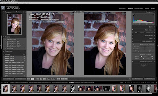
After the last post, I thought it might be good if I went through an example of how I would color balance an image in Lightroom. I’m going to use a image of Jenny, one of my Production Associates who helped me test out a lighting technique the other day.

We were working with some off camera flashes balanced with natural light. I’ll try to do a post on that shoot another time, but I had some of the images in Lightroom, so let’s take a look at what I’d do with an image we made.

To correct density for an image, what we’ve found works for us is to first set the exposure to the point where the image shows some true whites in it, then set the shadows to set the black point and then use the brightness slider to set our mid-tones.

Depending on the image, we want to see true whites and true blacks and nice middle tone details. For instance, if we have a groom in a black tux, we want to see his teeth as white and his tux should have parts on it that are truly black.
To do that, we first use the “Exposure” slider to set our “white point.” We will move it up and watch it until it shows that some of the white pixels on the image are “blown out”. Pixels have a britness setting from 0-255. When they reach 255 they are as bright as they can go. We like to see some pixels that barely reach 255. Maybe they are 250 or 253.

Then we will back it off a little until they are right at the brink of being blown out. The image looks like this:


Then we will do the same thing for the “Blacks” in an image. We want to see some true blacks “0” in the shadows. This is especially nice if you can get it in the subjects hair. Be careful not to lose all the shadow detail in the image.


Then, we’ll bring our brightness down to the point where we have pleasing mid-tones and we’ll set the color tempature, saturation and vibrance to get the images color where we want it:


The Lens correction dialog is very useful in creating vignettes that focus the attention on our main subject by applying a dark vignette around our subject:


And finally, we’ll zoom all the way in and make our sharpening selection.


And in the end we have a much more pleasing image:

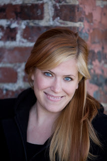
Straight Out of the Camera:


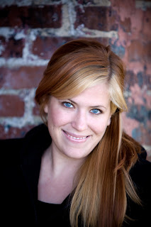
After Lightroom:

How We Color Balance our Images


There are extensive tutorials on the Adobe site, but I thought I’d give you a quick peek at how we use it.

First we import all the images using an Import preset we created for Photojournalism. That preset provides a “baseline” for all our images. We click File and then Import Images and import the RAW or Jpeg files into Lightroom.
After we have the images in Lightroom we begin working on them.

For each image, we have to decide how we want the image to tell the story. If we want a photojournalistic approach, then we’ll color balance the image to be something you’d see perhaps in Time Magazine or National Geographic.

If we want a more editorial look, we’ll stylize the image like something you might see in a fashion magazine. We might use some of our “creative” presets and do some cross processing, or make everything really blue and moody or bright and happy (like our California girl preset.)

Once we’ve decided on a look, we color correct each image. We set the exposure, then the blacks and then change the brightness to get the midtones where we want them, then we tweak the overall contrast. That sets the “Density” of the image. We like to see true blacks and true whites in every image if possible.

Then we’ll work on the color. We’ll first check the white balance. We may make the image warmer or cooler using the Temp and Tint sliders. After we have our white balance, we’ll set the Vibrance and Saturation to get the amount of color in the image we want.

The Vibrance slider algorithm tries not to affect skin tones so if we are happy with the skin tones we have we’ll use the Vibrance slider to make the other colors pop in the image and if we want some more “tan” in their skin, we’ll use the Saturation slider a little and then the Vibrance slider. It seems like we just use the Vibrance slider most of the time.

After we’ve set the Density and Color then we’ll do any red eye correction and spot correction. Then we’ll set the Vignette using our Vignette presets or the Lens Corrections dialog. If we use a strong Vignette, then we might have to change our density a little to compensate (make it brighter again).

The final thing we’ll do is sharpen our image using the Detail Sharpening dialog. If it’s a portrait we want to make sure we have a “crisp” image but not one that’s so sharp that someone’s pores show too strongly. Adobe has a portrait sharpening preset that comes with it that sets the Amount to 35, Radius to 1.2, Detail to 20 and Masking to 70. Landscapes are set at 40, 0.8, 50, and 0. I generally start there, zoom in and then make adjustments as needed.

If there is noise in the image we will use the noise reduction dialog. If there is one color in the image that is distracting, like someone’s pink shirt, we’ll use the HSL dialog to tone it down a bit.

After all the images are color corrected, we’ll renumber them and then export them as Jpegs. We use the export dialog to burn a disc so we’ll have a hard copy of all the Jpegs for the physical file.

Once the Jpegs are created and the Jpeg discs are made, we’ll remove the folder from Lightroom.

After the Images have been color and density corrected, we’ll edit the images in Photoshop and do additional retouching work such as selective sharpening, dodging and burning and liquefy.

And that’s briefly how we do our color balance work here at my studio. I hope that gives you some ideas around your own workflow.

We have a new D300!


They shipped out Thursday and Friday we added a new D300 to our studio. We were one of the first studios in Georgia to get one and have been on the waiting list for months. We're actually still on another waiting list for a 2nd body!

I have been testing this camera out for a couple of days now and I wanted to let you know a little bit about my experience so far.

First, I am in love with this camera. It focues extremely fast even in low light situations and the noise at low ISOs is really amazing after using the D200s for so long.

Adobe already has Lightroom 1.3 out so we can start working with these images right away.

I have been using the amazing Cannon 5D for a while now and it has great low light capabilities and the color is just beautiful. Cannon had the edge on Nikon with noise, but now, Nikon is now just as good, maybe even better, but I'll have to shoot with it a while before I make that call.

I strongly suggest if any of you guys are looking for a great camera to do portrait, wedding or even commercial work, that you consider the D300!

Here's a great review on the D300:

http://www.dpreview.com/previews/nikond300/

Adobe Photoshop Lightroom


Adobe Photoshop Lightroom

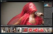
If you are into editing images and want great color correction capabilities and want a clean and simple interface, I recommend Adobe Photoshop Lightroom! We’ve been using it since version 1.0 (okay, so it’s only on version 1.3 now) and while it has had a few “Version 1.0” bugs, they have been addressed and it’s really made us much more efficient and allowed us to produce better results than ever before.

Lightroom costs $299. We think it’s well worth it. All of our PCs have it installed and we use it on every job we do here at our studio. I can’t recommend it enough!

Wednesday, November 21, 2007

Our Workflow After Capture

From time to time we get asked from other photographers what goes on after we capture images in the camera in my studio production group. There are so many individual steps that I’d like to go through in detail in future posts, but I thought I’d give you a general idea of our process.

First and foremost, we make sure to Archive those images and get them offsite! We have one PC that is dedicated to creating DVD backups from the memory cards we use. It burns the DVDs, creates labels and stores it on our network drives. We have over three terabytes (as of right now) of storage for our photography files. Yes, we shoot in RAW and wouldn’t have it any other way!

After the Archive comes the Edit. We look through all the images to remove any that have blinks and select the best from the session or wedding. We’re looking for images that best tell the story of the wedding or portrait that we were shooting.
Then, we import all the images into Adobe Lightroom and begin the color balance work. We love Lightroom and I’ll talk more about it in another post, but it’s been one of the best software purchases we’ve done.

We use some custom presets that we’ve created here to help us achieve the looks we want and then we tweak the images further until we get exactly the look we’re going for.

Then, we renumber the edited images and export them from Adobe Lightroom as Jpegs. Every image we produce here has a Job number and a sequential number assigned to it. So, some day in the future if a client brings us a photograph, we will just turn it over and see that it was “1345_0046” as the file name (our lab prints the file names on the back of our photographs). We will go to our files and look up job “1345” and get image number 0046 from the disc and reprint it.

After that, we take the color corrected images into Adobe Photoshop and run actions on them for selective sharpening and other color work. Then we do any final density and contrast adjustments, dodge and burn and vignette. When we look at an image, we’re looking for the story it tells. If there’s something in that image that is distracting from the story, we want to down play it by burning it in or take it out completely with the clone stamp tool.

Then, we post the images online or create a disc for our wedding clients and store a copy of the final Jpegs in a physical file folder we keep for all our jobs.
We keep all of our job information on a custom designed online database that we created to keep track of things in our studio.

Tuesday, November 20, 2007

Where can I get that???

I just got an email from an old friend who's wife has a photography business. He was asking about where he could get something. I thought some of you might like to know a few of the Vendors I use. I have a lot of sources, but here's a list of some of the ones we use a lot:

http://www.bhphotovideo.com – I get a lot of my camera’s and lenses here.
http://www.adorama.com – Another place I’ve purchased camera equipment.
http://www.whcc.com – A great lab! They always do great work for us and we love them.
http://www.mpix.com – A lab company that I send a lot of my client’s to for their needs. They do awesome work!
http://www.archivalmethods.com/ - They have great Archival supplies (we use them for our boxes).
http://www.leathercraftsmen.com – Joe Buissink uses this company to bind his albums. Our clients can have the same company bind their wedding albums as Jennifer Lopez has hers bound with. Joe also uses Graphie studio.
http://www.graphistudio.com – Yervant uses this company to do his fashion forward albums.
http://www.jampaper.com/ - has great packaging supplies!
http://dennybackdrops.com/ - has great backdrops and backgrounds
http://alienbees.com/ - Want to get into studio lighting? This company has some great lights that won’t set you back too much.
http://www.profoto-usa.com/ - Want to get some serious lights? They make some of the best lights in the business.
http://www.listerine.com/ - Really, as a friend, I’ve been wanting to say something to you about this.
http://www.millerslab.com/ - Another great lab to consider.
http://www.marathonpress.com/ - for some great marketing ideas and brochures.
http://www.overnightprints.com/ - This is a great printing company.
http://www.sandisk.com/ - Great memory cards.
http://www.wacom.com/ - Great graphics tablets!
http://quickbooks.intuit.com – Accounting software. Remember, it’s a business!
http://www.dpreview.com – Reviews on all kinds of digital cameras. I read this page often.

Monday, November 19, 2007

Give that Image some Texture!


This is so cool. Texturing is a lot of fun and a great way to make your images pop and add more interest. I love doing this sort of thing with Senior’s and or maybe even engagements. It gives the images a grungy textured appearance.

To start with, I go out and shoot textures that catch my eye. The one I’ll use for this entry was actually a rusty side of my Dad’s Box blade that he pulls behind his tractor. I photographed one side of it and then pulled that photograph into Photoshop and retouched it. This is what I was left with:


Jenny works for me as a production associate in my studio and was kind enough to let me photograph her. Here’s the original image of her:


I took one of the images we did and the texture I had made before and applied the texture to her image and wound up with something like this:


I first opened her image up in Photoshop. Once it was opened, I opened the image of the texture and the added it as a layer to Jenny’s picture by dragging the image over the top of hers. Once it was on top of her image in Photoshop, I changed the opacity of the Box Blade image to 30 percent and changed the mode to “Hard Light”. The different modes produce different effects, some of which are really cool. Here’s the Photoshop file in case you’d like to play around with it:

Click Here to Download a small PSD of this file.

It’s fun to just go out and shoot sidewalks, bricks, glass, anything that catches your eye and then superimpose it over your images. It’s a great tool to tell your story the way you want it to be. I think it’s kind of artsy and I think it’s pretty cool at times.

I hope you enjoy the idea and go out there and make it your own!

Friday, November 16, 2007

What Mode?


There’s so many ways to do something in photography and no one way is absolutely right for everyone. But you’re here on my blog, so I’ll share with you how we shoot around our studio and why.

MANUAL MODE

Manual mode is your friend. I don’t shoot manual mode all the time, but I think it’s important to be able to. I have some friends who went to college to be photojournalist. They were handed a manual 35mm camera and taught to shoot it manually. They shoot in manual mode.

If I’m in a tricky light situation, for instance a dimly lit church with a bride in a white dress and a groom in a black tux (how often can that happen?), I always switch my camera to M for manual mode.

Typically in that situation, I’d fire off some test shots of the front of the church to start with and make sure the exposure is right. I know that if I shoot anything less than 25th of a second and people are moving quickly, I’ll get really soft, blurry images, so if the camera meter tells me I am underexposed at 25th, I’ll open up my aperture from let’s say F4 to F2.8 and increase my ISO from 800 to 1250 or 1600 until I get the lowest ISO and the best shutter speed I can afford.

So if they are standing there saying their vows, I can use 25th, and decrease my ISO. If they are lighting the unity candle, I’ll go up to 40th and increase my ISO. I always try to use the fastest shutter speed I can get away with – 60th or higher is best and the lowest ISO (1000 and less depending on gear). The higher the ISO the more grain will be on the film.


APERTURE PRIORITY MODE

Dennis Reggie shoots his weddings on Aperture mode (A in Nikon, Av in Cannon). The idea is that you pick the Aperture and let the camera select the correct shutter speed. So if you are doing a close up of someone and you want the background blurred out (for a shallow “depth of field”) then you would pick a larger aperture, for instance 2.8.

If you had a group shot where you needed to be able to see everyone in the back row as easily as you can people in the front row and it was outside, then you would pick a smaller aperture, for instance F8.

Some less expensive zoom lenses can only go as large as F4 or F5. For instance you can get a 100-200mm lens for around $200 that has a maximum of F4 or you can spend $1600 and get a 70-200 that can do 2.8. (If I was on a deserted Island and could have only one lens I would want my 70-200 2.8!)

The difference is that the more expensive lens lets in twice the light so if you are shooting in a dark church someplace, you can get a great shoot of the bride and groom close in and it won’t be a soft picture because the shutter was too slow or grainy picture because the ISO was too high.

Personally, if I have a kid in the park and that kid is running around playing and the light is constantly changing, I’ll set the camera to Aperture Mode at 2.8 with my 70-200 and fire away. I’ll have split seconds to capture the kids smile as he looks over his shoulder running away from me as I chase him. I’m using all my attention to frame the shot and anticipate the moment.

I like using a 2.8 aperture for portraits (like 2.8) because it makes the background really soft. They make some lenses that go to 1.4, or even 1.0.

PROGRAM MODE
At a recent seminar I attended, Joe Buissink said that he uses program mode most of the time. He says he knows his cameras so well that he knows in any situation what they are going to do. He says that he might grab a quick exposure from the carpet and do an exposure lock and then photograph the couple.

He also said that sometimes he’ll pick the certain apertures. I assume from that he also shoots Aperture mode.

I’ve seen videos of him shooting and he shoots very fast. He’ll see a shot and toss the camera up to his face and take the image in less than a second, and then he’s looking for the next shot. I believe he shoots program mode because it allows him capture so fast.

Program mode might also be good when you’re shooting group shots and you want the maximum depth of field.

SHUTTER PRIORITY MODE
Shutter priority lets you set the shutter and then the camera sets the aperture to what it needs to be. Some people like to use this mode for sport shots.

OTHER CONSIDERATIONS

I also find that the Nikon D200 has a better light meter in it than the Cannon 5D or 30D. The Nikon camera meters see in color where the Cannon see in black and white so when you set the camera exposure, you have to compensate more with the Cannon’s than the Nikons. The Cannon’s have much less image noise at higher ISOs.

The Nikon D3 and D300 are about to be released and they are reported to have amazing ISO performance. We’ll see. Every year or two it seems that technology just gets better and better. There’s never been a better time to be a photographer!

I guess if someone was starting out and asking me how to shoot portraits outside, I’d tell them to set the camera to 400 ISO, Aperture priority at 2.8 for one subject, open it up a bit more for two subjects to F4 (like an engagement with a guy in back and the girl in front) and if they were shooting a big family shot, then open it on up to F5.6 or F8 and concentrate on the framing.

I’ll post some more information on depth of field in later posts but wanted to give you some ideas of how different people shoot and why.

Wednesday, November 14, 2007

How to Read an Image


Okay, so you have your fashion magazine and now you have a photo that you like, but how do you read the image so you can go and make it your own?

First, look at the lighting. Is it natural light, or did they do it with studio light, or a mixture of both? If it’s natural light, then see if you can find where the sun was placed, where any reflectors were replaced and if the model is in shade. If it’s in the studio, try to find out all the light sources so you’ll know how to place your lights.

One of the best tips someone told me is to look at the eyes of the model and a lot of times that will tell you how the image was photographed.


For instance, in this image the actress is probably lit from a rectangular soft box placed to the left of the camera and another light source (maybe another soft box?) from directly above her to the right. She’s got her back to a window and some light is coming in through the window and lighting her shoulder.

So if I wanted an image like this for my portfolio, I’d find a bank of windows and using a light meter take a reading of the ambient light out the window and then set my two flashes up with soft boxes and balance them with the ambient light. I might even try to make them a stop or so above ambient so she would pop out from the image. Also, the temperature of the light looks warm to me, so I might try using a warming gel over the flash.

Or, if I wanted to try to keep things simple and was trying to do this all using just my digital camera and no additional lighting, I’d try to find a bank of windows facing the sun, pose her in this manner and then using a large white poster board or foam core board, reflect light onto her face. If I was on a budget and didn’t want to buy a gold reflector, maybe some gold fabric to put over the foam core might be all the warming I needed for her.

If I was trying for this look for one of my clients, say a bride on her wedding day, I’d place her back to the church windows, using a reflector bounce light back up onto her face and get her to lean on her left arm so that shoulder would raised and then ask her to turn her head a little to the right and then cut her eyes back at me. A lot of times I wind up getting clients into places where the light is great and then just let them be themselves and have fun with them so I can get a chance to make a great shot.

Sometimes I’ll start out trying for a shot like this and then I might tell her to look out the window and find that there’s a totally different shot there. I might shoot directly into the sun and make her a silhouette. There’s so many things to explore while you’re shooting.

I’ll post some more specific articles on how I make certain shots, but I wanted to give you an idea of the thought process I have when I approach a shot.

One thing I want to note is that I’m not advocating copying verbatim another photographer’s work. What I’m suggesting is that by looking at amazing photography you can find techniques that you can use to tell your own story.

How I Learned Photography


And really, how I still learn photography.

My wife Kerry gets Vogue magazine to keep up with the latest tips and techniques for women’s fashion, and sometimes she even manages to get to it before I do. Last Christmas some friends of ours bought me subscriptions to several women’s magazines, not because I look good in pumps, but because that’s one of the ways I learn about photography.

There are some of the most gifted and talented photographers in the world who shoot images for the top fashion magazines. They will spend all day and thousands of dollars (sometimes tens of thousands) to get images that sell an idea to women.

It’s the idea of glamour, sexiness or romance that sells the clothes and when you see an image of a beautiful woman wearing a Prada bag on her shoulder, the message is that if you buy Prada, you’ll be glamorous just like her. They are selling a feeling.

As a wedding and portrait photographer, I do much the same thing, only the clients I photograph are real and so are the moments they are photographed in. You can take the same techniques and make an image that’s real and also beautiful and make it even more meaningful for your clients.

It’s the best five dollars I can think of to purchase a fashion magazine, find images that you think are compelling and go and make them your own.

Giving Back

Hello!

I get asked questions all the time about photography. I always do my best to answer as much as I can, but wind up wishing I had more time to hang out with someone and show them the answers instead of just telling them.

So that’s how this website was born! I want a place on the internet that I can point people to where they can see some of the things we’ve learned along the way and hopefully leave a comment or two where other people can learn as well.
So enjoy!

I hope you find something here that will help you out and give you ideas for your own photography!

All the best,

Delaney